That's why I've begun studying his work and sharing my findings with you. I think he has a lot more to give to the writing and marketing community, even though he passed away.
That's why today I cover one of his legendary ads for The Economist. The Economist is a newspaper that focuses on current affairs, international business, politics, and technology.
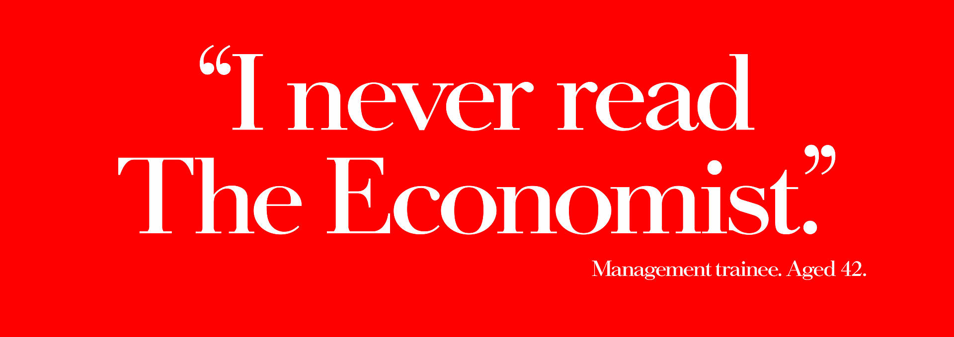
Here's the original ad from 1989:
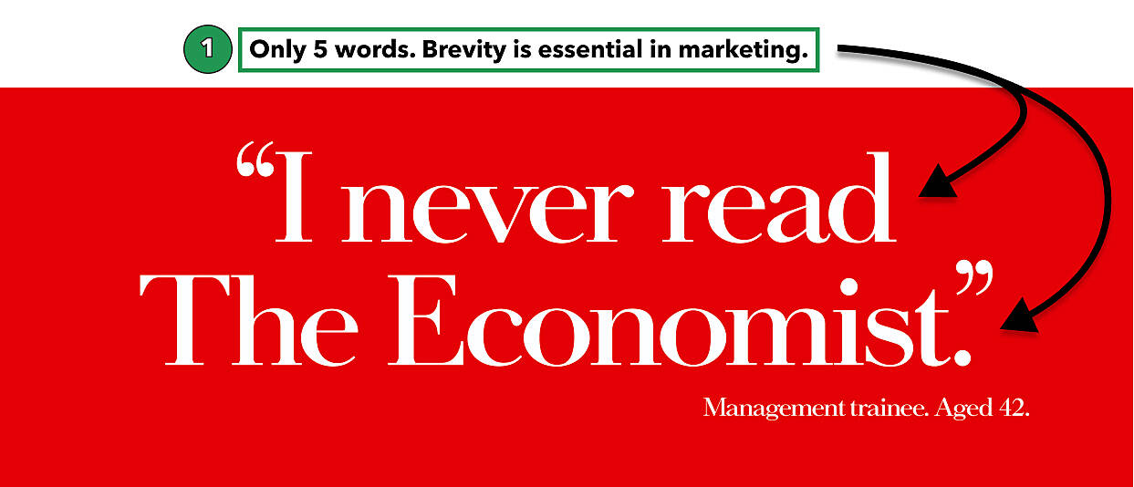
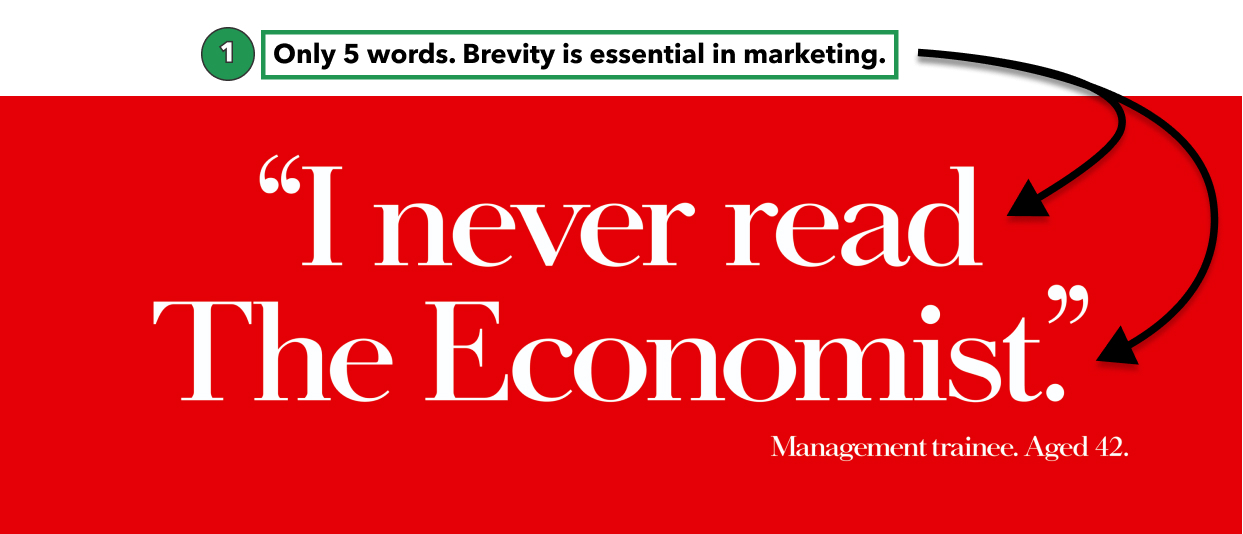
Finding #1: To say more, type less.
This ad says what it needs and nothing more. Nowhere on this ad does it include what The Economist is, a list of benefits for reading, or where you can purchase "it."
David was a great writer and understood a fundamental writing and marketing truth: To get your message across, boil it down to one point; the challenge is figuring out the one point.
"If I had more time, I would have written you a shorter letter."
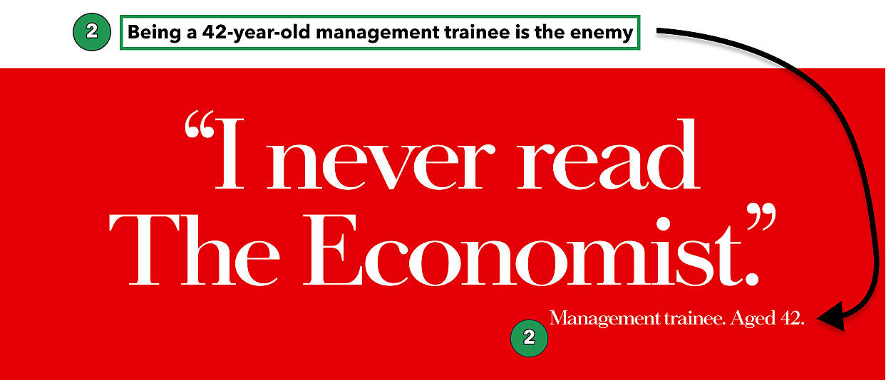
Finding #2: Rally against a common (unidentified) enemy.
Salesforce's enemy = Software
Drift's enemy = Forms
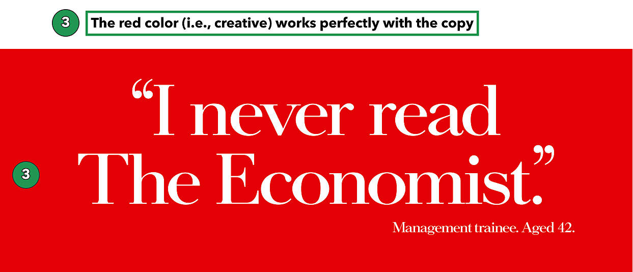
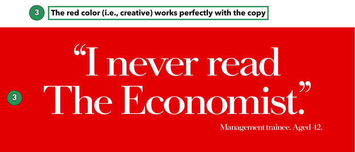
Economist's enemy = 42-year-olds who are still management trainees
There is a reason I excluded Coke vs. Pepsi or McDonalds vs. Burger King. Those are bad examples because they made the enemy a company. That's playing the "better than them" game which quickly gets you into a price trap.
Instead, make your enemy faceless and something your ideal customer is already bothered with or trying to avoid. For the Economist, it's being a Management trainee at 42-years-old; that's the enemy, so to prevent it, I read the Economist.
Finding #3: Use your creative (colors, text, pictures) to enforce your message.
At first glance, this ad seems vanilla. Some may even dismiss its effectiveness by saying, "It doesn't do anything for me." And you'd be somewhat right. Consciously nothing happens, but subconsciously, everything is happening.
When you see red, your brain goes into defense mode (think the color of decreasing stocks if you're from America). So before you even read it, your brain is bracing to stop or resist.
The whole premise of the ad is that the ideal prospect would reject this notion and realize that to avoid becoming a Management trainee at 42, they must read The Economist.
The color red works well with the anti-statement. If it were green, that'd be weird. The Economist's brand colors are also red, which is sprinkles on top at this point.
⚔️
That's it for today's Throwback Thursday Ad Buildup. It was a short ad, so I only have three findings for you to apply to your writing and marketing.
What's one takeaway you had that you will apply to your marketing?
🧠 + ❤️ // JO
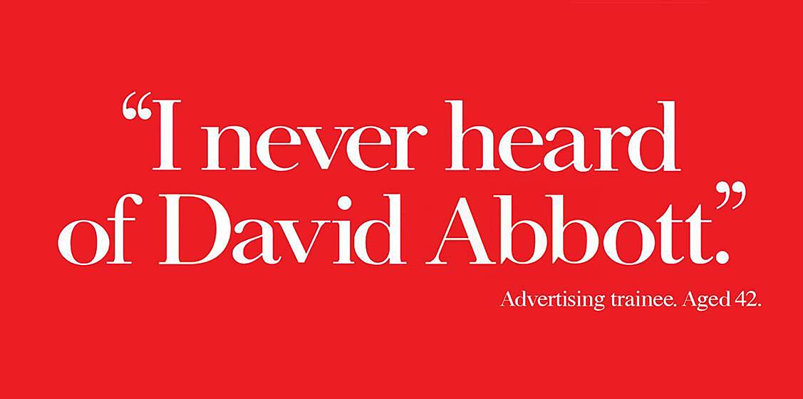
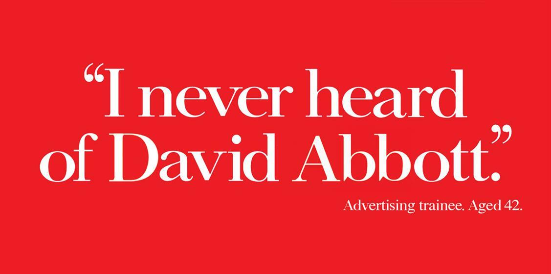
P.S. I found this remake of the original 1989 ad funny: